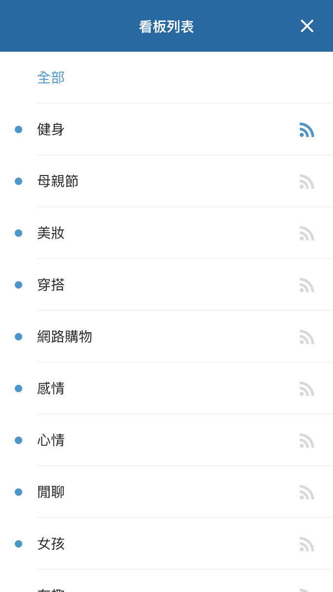
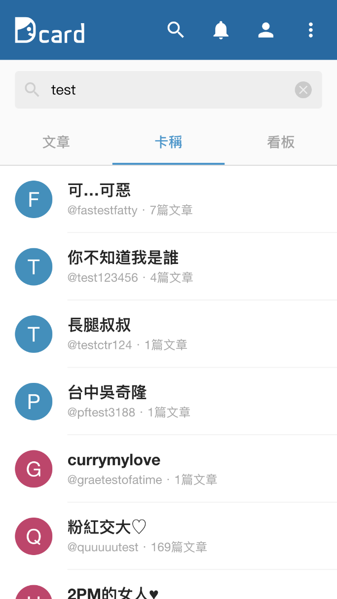
Dcard Mobile Web
The New Mobile Web

- 2 Months Intern Project
- Frontend Developer
- Bundle Size Optimize
- Mobile Devices Compatibility
Internship
Dcard is one of the most known anonoymous forum for college students in Taiwan. In the 2 months internship at Dcard, my job is to make the new version of the Dcard Mobile Web (the site is currently maintained by other). In the project, I was the only developer at the time. With the guidance from other Web Team members and the source code of desktop version, I was able to finish the early version of the new Mobile Web.

Challenges
The challenges of this project are:
- (1) Reducing the bundle size
- (2) Handling the complex states of the application
- (3) Compatibility for many different devices
Bundle Size
In order to reduce the bundle size for mobile users, I had to dig into the Webpack build details and see which modules are large or redundant. Thankfully there are several tools can help me do that, like webpack bundle analyzer. They visualize the bundle structure, module sizes, and even how many times a module is referenced. With the information above and proper Webpack configuration, I was able to reduce the whole bundle size by several megabytes.
Compatibility
Compatibility is the most important part of a Mobile web project. There are thousands of thousands models of mobile device on the market. I have to make sure the site works properly on all of them (ideally), so I had to test the application on many different devices.
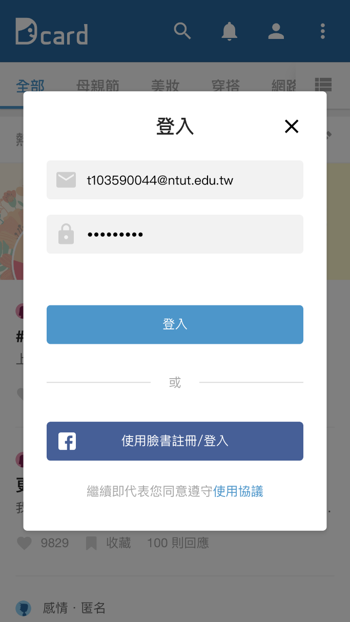
The most challenging part is to make everything look the same in In-App Browsers such as Line, Messenger, Facebook in-app browsers. Although they're all using same browser core, the different layouts in each applications usually breaks some part of the CSS (usually fixed position elements). I surveyed many other Web App like Twitter, Instagram, and Medium and refered their solutions. Usually, they abandoned many beautiful layout for the sake of compatibility. For example, they usually avoid using Pop-Up modals for forms and directs users to another page for forms instead.
Pop-ups in Dcard Mobile Web:
